
If you design your own section for example with display: flex, it is important to know at which px number the Divi breakpoints are. For example, if you design your own Divi blog post layout.
What are the Divi Breakpoints?
The Divi Breakpoints are the pixel widths at which the layout switches from desktop to tablet or from tablet to mobile.
For example, on desktop you have 3 columns and on tablet you have only 1 column, but 3 rows. The pixel width at which this switches is the breakpoint.
For the CSS geeks it is called CSS Media Query Breakpoints.
Divi has its own CSS breakpoints.
The 3 Divi breakpoints are:
- Desktop: Screen width of 981 px and above.
- Tablet between 980 and 768 px
- Mobile: 767 px and below
What are the Divi CSS Media Query Breakpoints?
The Divi Media CSS Media Query Breakpoints are the same as the Divi Breakpoints.
Only you can add your own styling with the CSS.
/* Desktop */
@media all and (min-width: 981px) {
  /* Your CSS */
}
/* Tablet */
@media all and (min-width: 768px) and (max-width: 980px) {
  /* Your CSS */
}
/* Mobile */
@media all and (max-width: 767px) {
  /* Your CSS */
}
How do I customize the Divi settings?
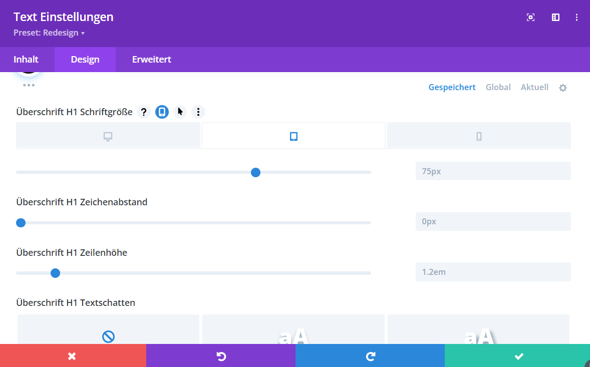
If you want to customize the Divi settings for mobile or tablet, you can do that for each property by clicking on the mobile icon.
That’s all.. now you know how to make Divi fully responsive.


